How to view Librarianship Studies & Information Technology blog best on a desktop or a mobile phone and overcome the problem in reading the contents due to “background” and widgets in the left and right columns?
We receive very positive feedback, reviews, and testimonials of Librarianship Studies blog's contents, however, we also frequently get one negative feedback which is about our blog’s interface and problem in viewing the contents of the blog which gives strain to the eyes.
One reader Tatjana Versaggi from New York commented on LinkedIn “Salman, I love the idea of the content. It's impossible to read, however. The mobile experience doesn't work and the background is so busy, I am unable to read the words!!”
We are aware of this problem. This blog runs on Google’s Blogger or Blogspot service where you have the options of choosing a template and/or making changes to an existing template. We tried to make changes to the template but we were not able to do it successfully. Right now we are concentrating on the contents of the blog and after some time we will try to go for making the blog’s interface better by taking the help of the experts.
So here we are providing some tips on how to best view Librarianship Studies blog and overcoming the viewing problem due to “background” color.
Which web browser is best for viewing Librarianship Studies blog?
We recommend Google Chrome to view Librarianship Studies blog.
How to best view Librarianship Studies blog on a mobile phone?
Problem: Open the blog in a browser. A screenshot of Librarianship Studies blog on a mobile phone is given below when opened on an android phone. It is obvious that the actual content of the blog article occupies less space in between, the font size is small, and background gives strain to eyes. The contents are not conveniently readable.
 |
| Librarianship Studies blog on a mobile phone |
Solution 1: If you do “double tap” in the middle of the contents then it will occupy the screen properly by itself. This works on an android phone as well as on an iPhone. Below is given the screenshot of the mobile after you do a "double tap" one after another quickly. You can see in this screenshot that there is no background and font size problem, and the contents are very much readable.
 |
| Librarianship Studies blog on a mobile phone |
Solution 2: If this not works, then alternatively you may zoom in manually to fit the screen with actual contents of the blog article in a perfect view where you only see the contents of the article and not the left and right columns and background.
How to best view Librarianship Studies blog on a desktop computer?
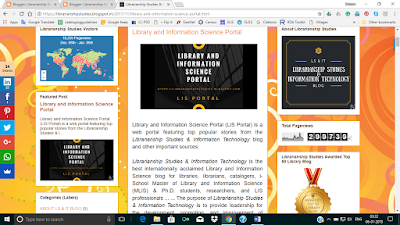
Problem: Open the blog in a browser. A screenshot of Librarianship Studies blog on a windows laptop is given below. It is obvious that the actual content of the blog article occupies less space in between and background may give strain to eyes. The contents are not conveniently readable to some people.
 |
| Librarianship Studies blog on a laptop |
Solution 1: Open Librarianship Studies blog in the browser. Locate the "Zoom" option which is at the top right side of the browser. You can reach here (Zoom) by clicking on the three dots ... placed on the top right side of the browser. Then increase the "Zoom" from 100 to 150. Now resize your browser by squeezing from the left and right side, so that the blog article's contents occupy full space and left and right columns are not visible. Then open some tool like Microsoft Word in the background or any other program having a "white background". Now put your browser window above the "white background"
It will be better if you can set your MS Word (or any other) program in such a way that you get maximum "white background." Now you get a conveniently readable screen as below.
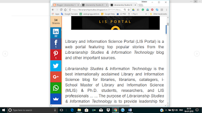
Solution 2: Open Librarianship Studies blog in the browser. Locate the "Zoom" option which is at the top right side of the browser. You can reach here (Zoom) by clicking on the three dots ... placed on the top right side of the browser. Then increase the "Zoom" from 100 to 200.
 |
| Librarianship Studies blog on a laptop |
 |
| Librarianship Studies blog on a laptop |
Please let me know if this solution works… and it solves the background problem.
FEEDBACK
NOTE
After this blog post was written, we have made changes to the blog's background and other things to make the viewing experience good. Still, suggestions made in this blog post applies to make viewing even smoother. |
SEE ALSO
- See this article on LinkedIn: Librarianship Studies Viewing Experience: Problems and Solutions
- About Librarianship Studies & Information Technology
AUTHOR
- Salman Haider - Librarian Cataloger Blogger
HISTORY
- Written: 2018-01-06
PERMALINK
FEEDBACK
- Help us improve this article! Contact us with your feedback.
Thanks all for your love, suggestions, testimonials, likes, +1, tweets, and shares ...


